
Friday, 22 March 2013

Thursday, 21 March 2013
Wednesday, 20 March 2013

Evaluation - Question 2

I felt that using this colour scheme inspires the young target audience that are mostly likely in the E category of the demographic scale, still in education. A shared common experience is teenagers hearing of how their parents went
through
the great ‘phases’ when they were at college or university but those that are
also describes as the best years of their life.
My
magazine is purposely put at a low cost as those inside the E category do not
generally have large amounts of disposable income as they are still in
education. Therefore, I priced my magazine around £2, a happy medium between a
low quality 50p magazine, written poorly with the majority of pages being
meaningless advertisements, and a high quality £5 magazine, printed on more
expensive materials, glossy cover and written by high paid, renowned writers.
Furthermore, the magazine aims to only have around 35-40 pages, making it a seemingly short magazine. This is because my target audience are likely to still be in college/university and will therefore already struggle to find the time to finish all of their work never mind have spare time to read a magazine. Therefore MOB magazine aims to keep news short and snappy, with finely tuned articles that deliver all of the information needed in not too many words. Furthermore generally speaking, college students aren’t likely to want to read pages upon pages of anything even if it’s about something they are interested in, therefore it is not necessary to print all of these extra pages with such a low percentage of the target audience that would read them.
Furthermore, the magazine aims to only have around 35-40 pages, making it a seemingly short magazine. This is because my target audience are likely to still be in college/university and will therefore already struggle to find the time to finish all of their work never mind have spare time to read a magazine. Therefore MOB magazine aims to keep news short and snappy, with finely tuned articles that deliver all of the information needed in not too many words. Furthermore generally speaking, college students aren’t likely to want to read pages upon pages of anything even if it’s about something they are interested in, therefore it is not necessary to print all of these extra pages with such a low percentage of the target audience that would read them.
Famously,
record shops when in their prime were meeting places for the younger kids,
turning up, saving their money and speaking to people that share similar tastes
in music, and being recommended music by the connoisseurs that were the record
shop owners. I wanted to create this idea but in a modern concept of a
magazine, featuring both underground and popular artists that readers could
discover and find out information about artists that they may never have heard
about yet could go on to be one of their favourites.
The
reader profiles I looked at were NME and MOJO magazine, both magazines that
don’t quite represent the mainstream music industry but mostly artists of an ‘alternative’ genre in some way or another which is similar to mine.
From the two, I found that the age range can vary for this genre of music, with
NME featuring new and upcoming artists as well as their inspirations in the
form of older, classic bands and this appealed to a much younger audience. MOJO
however generally appealed to a much older audience that are in full time
employment with a regular income. This means that they can afford to spend a
little extra on a higher quality of
magazine with MOJO being more expensive than the average music magazine. The
content of MOJO was however the much older classic artists like for example the
likes of Paul Weller and The Jam.



Friday, 1 March 2013

Wednesday, 27 February 2013
Double Page Spread Draft 2

In this draft I experimented with having all of the text across the bottom of the page while including two images on top.
Tuesday, 26 February 2013
Double Page Spread Draft 1

This is my first draft for my double page spread, the image ensures there is continuity across the two pages and I felt that it also looks effective as it looks like the model is touching the words that he has spoken.
Both fonts for the 'it feels like im backwards' and the artist's name 'DeBouuy' are from dafont.com
I found both fonts under the 'groovy' section of fonts and I felt this ensured that the alternative genre of both the artist and the magazine were kept obvious.
Friday, 22 February 2013

Tuesday, 19 February 2013
Peer feedback - Rebecca Ives

My original inspiration for the contents page was MOJO magazine that conventionally have their MOJO logo printed across the top of the page in the centre with only one image of an artist along the right like the contents pages I annotated in my research into exisitng products. However, I will add two more pictures to the contents page, include the artist name for the model on the right of the page and change the layout to make the contents page look more conventional.
Friday, 25 January 2013
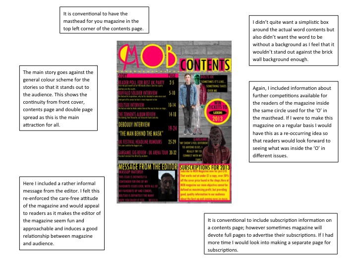
Final Contents Page

I changed the colour of the message from the editor and the box around it to the same as the contents list and also changed the colour of the subscription box against the colours to make it stand out. Finally, I decided to use the two images of Luke behind each other to represent him as an individualistic artist to fit with the genre of my magazine.
Wednesday, 23 January 2013
Contents Page Draft 4

I added an advertisement for a subscription opportunity in the magazine that is fairly conventional to see in a music magazine contents page. I also added a full black background for the contents list, I feel this looked more effective then seperate boxes. Also, I centralised the masthead and moved the contents back down above the list.
Tuesday, 22 January 2013
Draft 3

Here I put different coloured boxes behind the letter in the word contents, making the word stand out and to give it a more alternative look to it. I also placed a hue/saturation effect over the image of Luke that already had a negative effect onto it.
Draft 2

My teacher Becky recommended putting boxes around the text for the stories. I felt this looked much more effective then simply having it over the wall in the background, the text looks much more clear. Also I moved the word 'CONTENTS' to above the dotted line, making the layout fit to a much more conventional look for a contents page.
Friday, 18 January 2013
Draft Process - Contents Page

Added the title from my front cover.

Applied a style similar to that of MOJO magazine with dotted lines underneath the title.

Applied the desired background to the page. Then put the original image of classmate Luke posing as artist 'BOLTSXX' onto the page.

Applied black and white filter to make the text/colours stand out.

Applied effect to a duplicate layer of Luke.

Played with idea of Luke having multi-coloured shadow.

Put in the stories and page reference numbers for the actual contents.
Added box where I will put the message from the editor.
Added box where I will put the message from the editor.

Re-added the duplicate layer of Luke.

Started to write the message from the editor and added a photo of friend Ronan posing as the editor.

Changed the colour of text in the message from the editor to fit the colour scheme.
Subscribe to:
Posts (Atom)